As a graphic designer, I spend every day working with imagery, artwork and tools to create enticing designs for our clients. And every once in a while, I come across a design that truly blows my mind. These kinds of designs lead me to think about the process that went into creating the final work, and helps me find inspiration for my own work. Here, I wanted to compile the top graphic design themes that get me motivated.
Graphic Design Themes that Inspire Me:
Minimalist Styles
In the corporate world, a clean, cohesive design is important, and this is the type of design that appeals to many of our clients. I often draw inspiration from designs and artwork that are creative yet beautifully simple. Here’s an example from Bentwood Cafe:
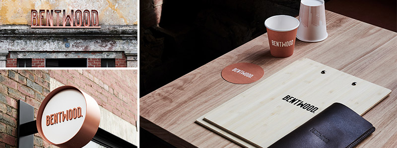
Bentwood Cafe via Behance
The design of their typography, materials and even the interior of their cafe is very simple, but still interesting. It’s important to find the balance between what’s visually interesting yet minimalistic, so it doesn’t overwhelm the viewer – or feel stark, bare or unfinished.
This website template from Behance is another example of a creative yet simple design. It’s functional but still visually appealing; I find it especially inspiring because it uses colors from nature, which I think many people are inherently drawn to.
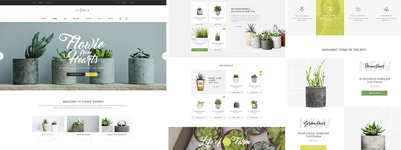
Flowie website template via Behance
One thing I really love about the Flowie website design is the subtle way that the logo is incorporated as part of the general layout. It’s faded out behind the three navigation images, giving a sense of depth and visual interest to the page.
Retro Designs
I take a lot of inspiration from retro designs, putting a modern twist on concepts that were popular decades ago. I think it’s refreshing to look back on trends from different time periods and incorporate those ideas into modern design.
These cans from Vocation Brewery are eye-catching, with a unique use of color; the design reminds me of something you might have seen in the 80s, but updated with a clean, modern twist. (As a side note, the craft beer industry can be a really great watering hole for any designer searching for creativity and somewhat-eccentric concepts.)
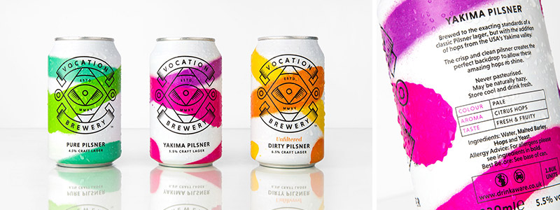
This type of tie-dye, retro design is making a comeback – several clients use gradients as an on-trend way to incorporate bold color into their brand.
Nature
Personally, I find myself drawn to natural colors, so I enjoy designing with natural color schemes when possible. I think many designers and artists can draw inspiration from the beauty of nature. As you can see in some of the examples below, a natural color palette doesn’t consist strictly of dull browns and greens. It can also include vibrant colors that give some liveliness to an image or design:

Succulents via Annie Spratt/Unsplash; Canyon via Justin Roy/Unsplash; Butterfly via Melissa Chabot/Unsplash
Textures
I love enhancing photography or designs with texture. For printed physical materials such as one-sheeters or business cards, the actual texture of the paper can be really important for messaging and branding as well, and change the entire vibe of your design.
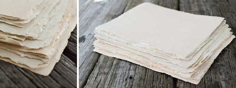
Handmade paper via PaperSlurry
Even if you can’t physically touch it, visual texture can evoke the same emotion as something tangible. Strong designs that incorporate some type of texture make you want to reach out and touch them. Many textures mimic things found in nature, such as wood.
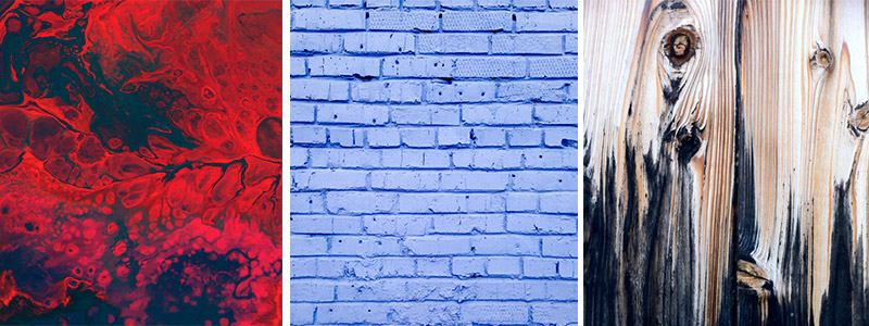
Lava via Cassie Josh/Unsplash; Painted brick wall via David Pisnoy/Unsplash; Wooden texture via Pinterest
Ingenuity
I really appreciate designs that take a simple idea and twist it into some type of clever messaging. These types of designs can be hard to achieve, and shouldn’t stray from the overall company brand, but when done right, they’re really sharp. They’re also most effective when using fewer elements to deliver an impactful message, because more content has the potential to overcrowd a design.
Here are a few of my favorite examples of ingenuity in design:
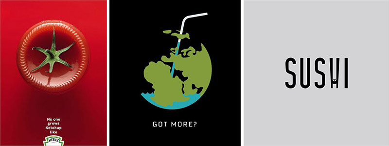
Heinz poster via A-DAY Blog; Got More? poster via med ness/Behance; Sushi design via Daniel Carlmatz/Instagram
Staying Fresh in Your Graphic Design
Even though graphic design is my craft, I like to take inspiration from creators of all different genres and media – ceramics, fashion, photography, whatever it may be. I can pull elements from all of these areas and use them somehow in graphic design.
Like the artist who designed a logo for the word “Sushi” above, I like to stay inspired by doing similar exercises for fun. It tests my ability to convey a concept or message that’s on brand, while getting creative at the same time. I also think it’s just as important to look critically at designs that might not be very strong, or that don’t inspire me. It helps me think about how that design could be improved, or how I might make it better if I was behind the wheel.
I hope these graphic design themes got you inspired! If you’re still feeling stuck, let our design team help you out. Contact us today.

Anthony Cedrone
Director of Web Development and Creative Services