This client wanted to push the boundaries of their brand with a refresh that felt exciting and new, yet maintained some key elements, such as their existing logo.


First, we reworked the basics: color palette, icon styles and fonts. Their engineers needed a broader palette to support complex charts and show lots of data at a glance in a clear, quickly digestible way. A wider range of colors gave that flexibility while still feeling cohesive as a brand.
![]()
![]()
![]()


We looked for emotional, people-focused photography to communicate the “eureka” moment that this client’s customers felt when using their products.
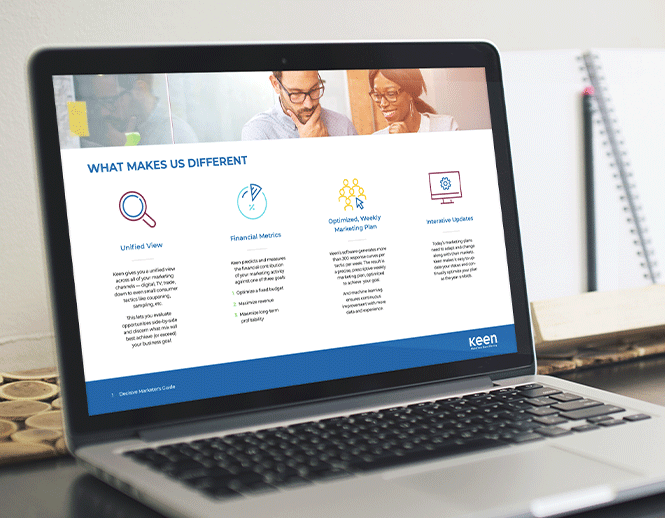

After the brand basics were set, we translated all of this into a set of clean, easy-to-read design templates that their marketing team could use for collateral, presentations, email and more. We also worked the new brand into refreshed trade show graphics and web page designs.
